- Readmore now has a separate setting for maximum height on small screens.
- Fixed some typos in the settings.
New Icon List child stack
I added this because I needed it myself and it really is quite useful.
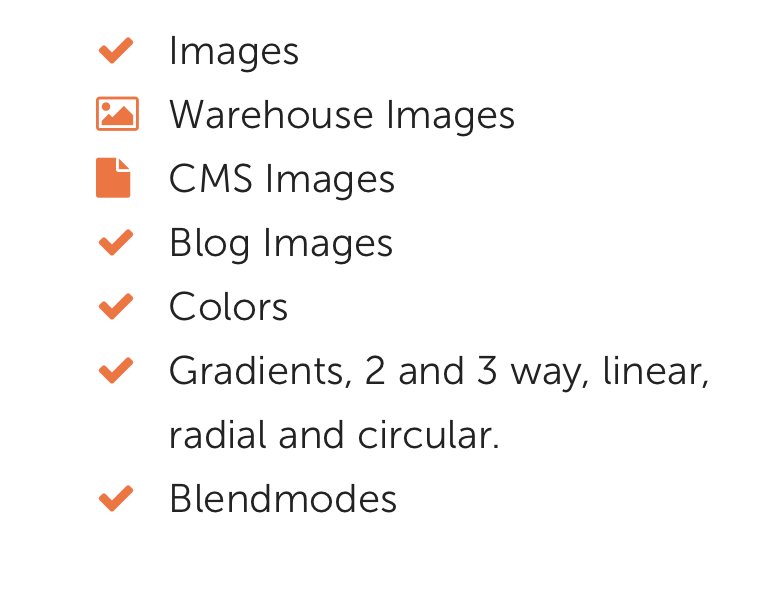
Icon List will pull FontAwesome icons to the left, color them and then indent the paragraph text. The text will also obey the indent if it wraps to a new line so that it all looks nice.

To use it, simply add the font awesome code for the icon you want to each line of the paragraph stack. (It doesn't have to be at the start but why would you not put it there!).
Add an Icon List child stack and choose your styles in the settings.
If you want other icons in the paragraph to no be pulled to the left, then just add the class no-indent to the FA code (e.g. "fa fa-check no-indent').
You can change the color. icon size and the indent space. Just be aware that if you make the icons a lot larger than the text then you may need to enable the line-height control to get everything to line up vertically; just adjust it in preview mode to your liking.


